Client
Menier
Participation
Creative Direction
Design
Project
Menier is a gourmet coffee shop with a new concept, specialized in cacao-based pastry. Its name is a rendition to the French family that democratized chocolate consumption in the 19th century.
It needed a brand that communicated the easygoing atmosphere of the shop, and served as a reference to the Menier family tradition.
Insight
The concept developed for Menier was based on the adjectives “unique and honest”. Its special recipes and relaxing atmosphere represent a unique offer, and at the same time, the communication tone towards clients doesn’t hesitate to show what it is and what it feels. This way it distances itself from clichés and traditionalisms.

![]()
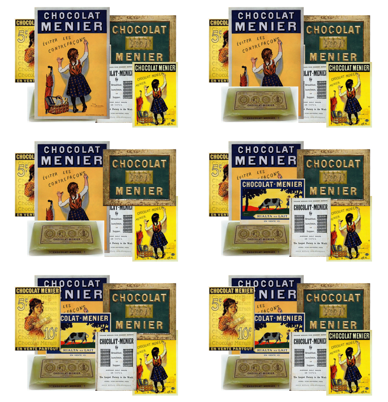
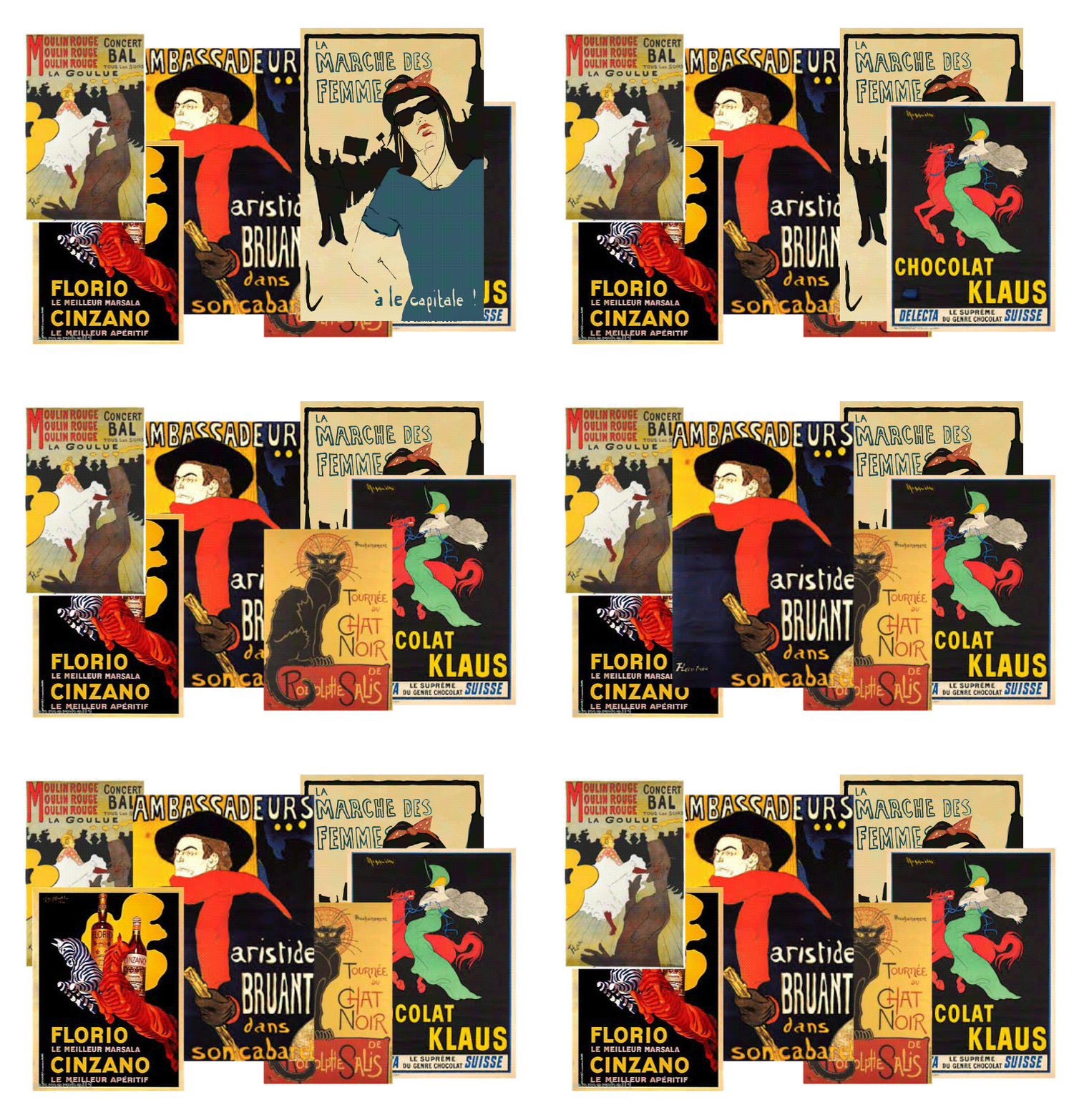
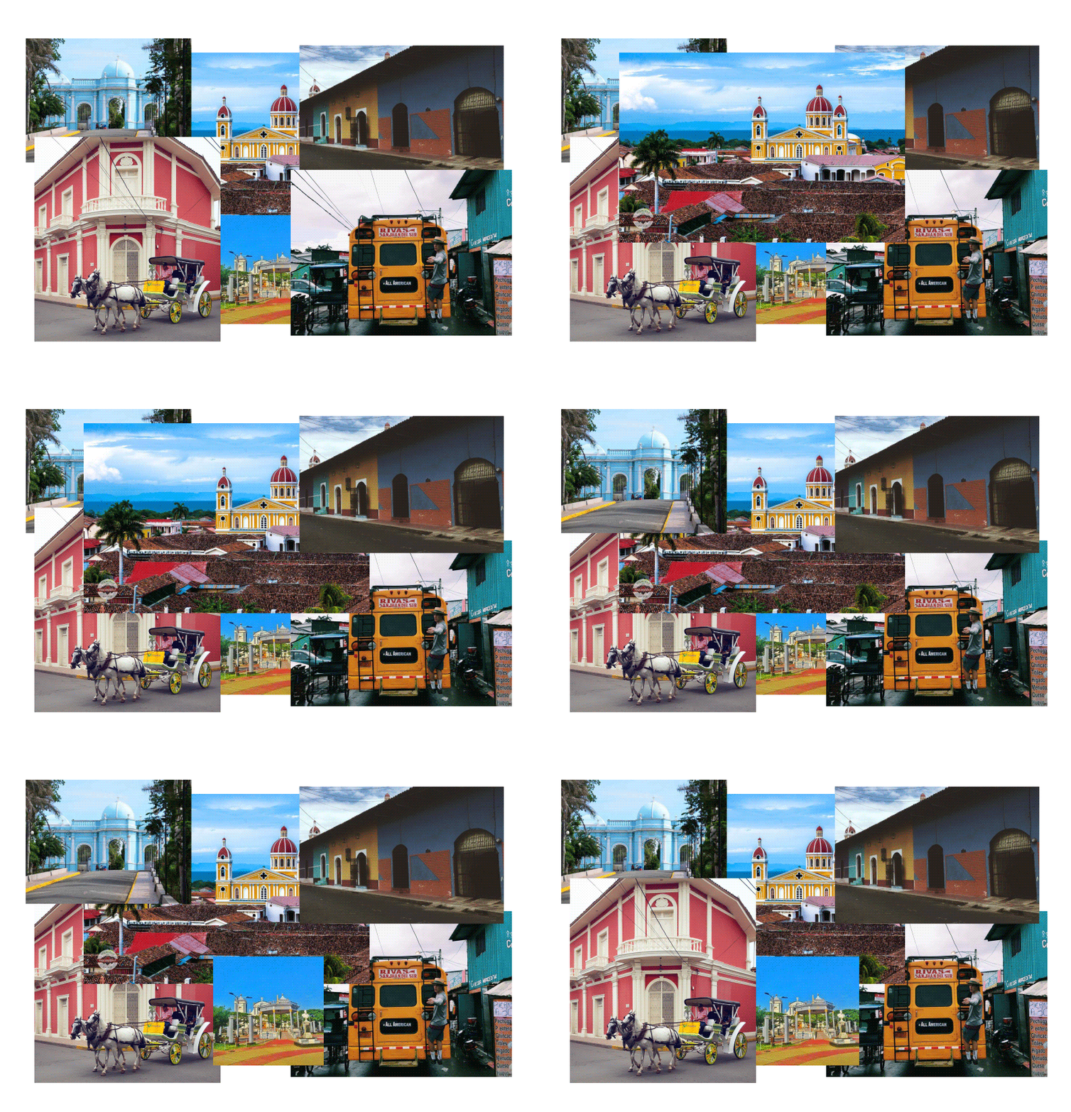
The analysis process required studying the graphic style Menier chocolate used in its origins, as well as the influence of French illustration, similarities in colors, shapes and typographic implementation. Once studied, these styles started showing similarities with Nicaraguan art, and the similar color palette colonial architecture aesthetics use, but in pastel tones.

![]()
![]()
![]()
![]()
![]()
![]()
![]()
![]()
![]()
![]()
![]()
![]()
![]()
![]()
![]()
![]()
![]()
![]()
![]()
![]()
![]()
![]()
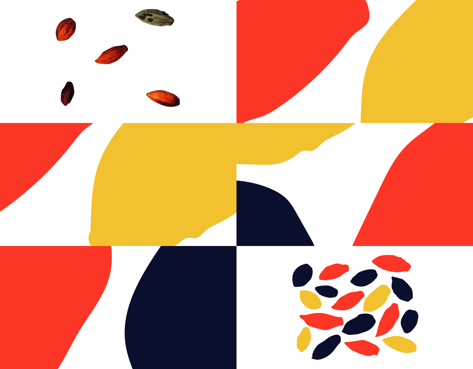
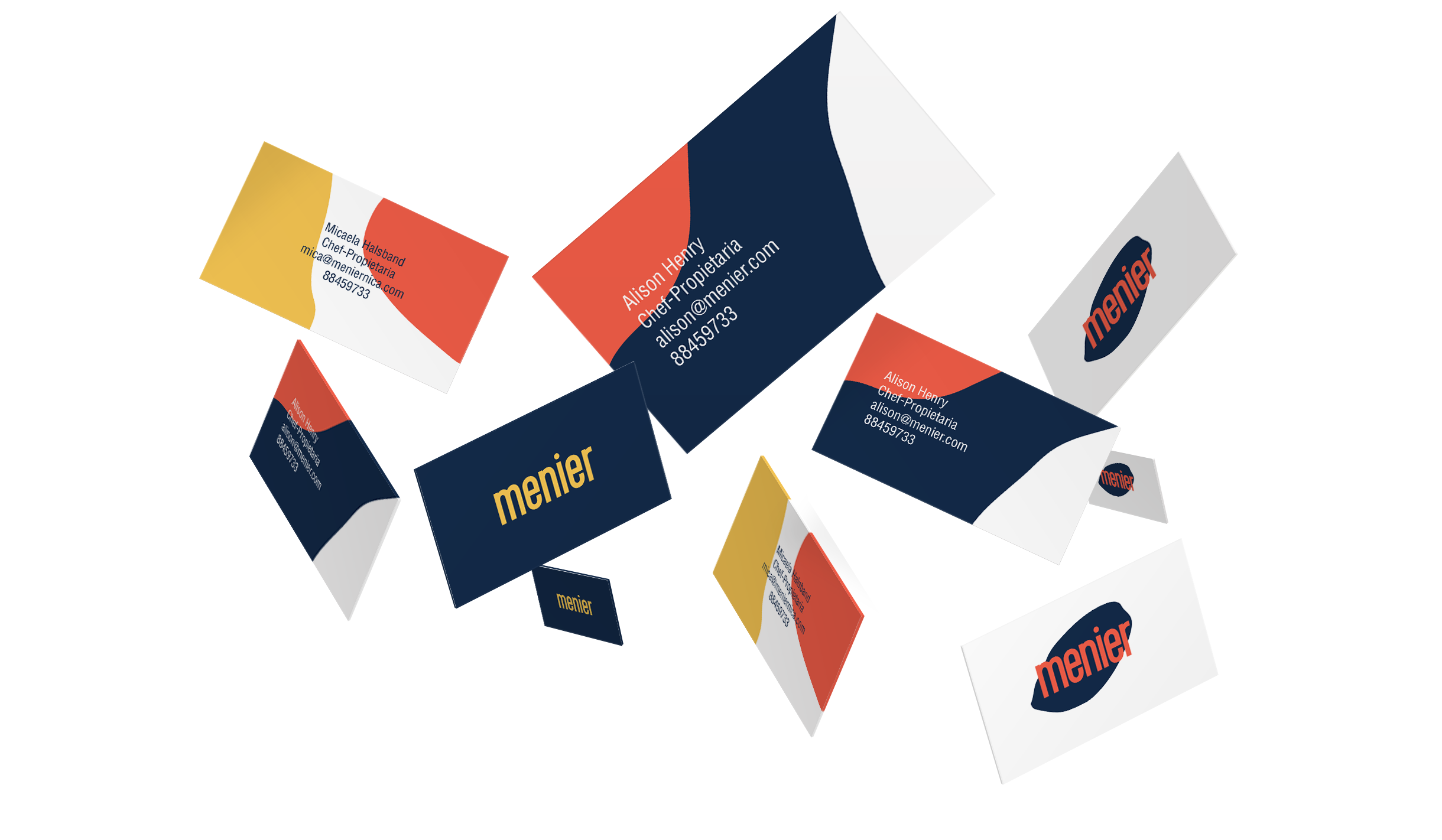
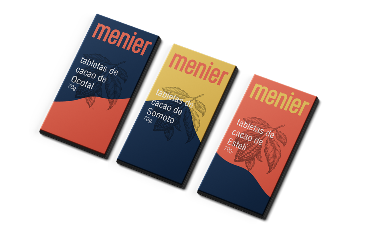
For the brand’s graphic concept development, we created a system with simplified shapes of cacao to create backgrounds and patterns to be used across all applications. This, in conjunction with a dynamic brand, allows us to communicate Menier’s relaxation and freedom.



![]()
![]()
![]()
![]()
![]()
![]()
![]()
![]()
![]()
![]()
![]()
![]()
![]()
![]()
![]()
![]()
![]()
![]()
![]()
![]()
![]()
![]()
![]()
![]()
![]()
![]()
![]()
![]()
![]()
![]()
![]()
![]()
![]()
![]()
![]()
![]()
![]()
![]()
![]()
![]()
![]()
![]()
![]()
![]()



![]()
![]()
![]()
![]()
![]()
![]()
![]()
![]()
![]()
![]()
![]()
![]()
![]()
![]()
![]()
![]()
![]()
![]()
![]()
![]()
![]()
![]()
![]()
![]()
![]()
![]()
![]()
![]()
![]()
![]()
![]()
![]()
![]()
