Concept Work
–
Full Design
Project
A full exploration project to experiment with product design and different development methods.
Insight
Since the project is driven by exploration, I selected the subject of craft beer, as it follows the same principles of experimentation and discovery I was going for.
01.The Brand
TYPE & COLOR & LINES
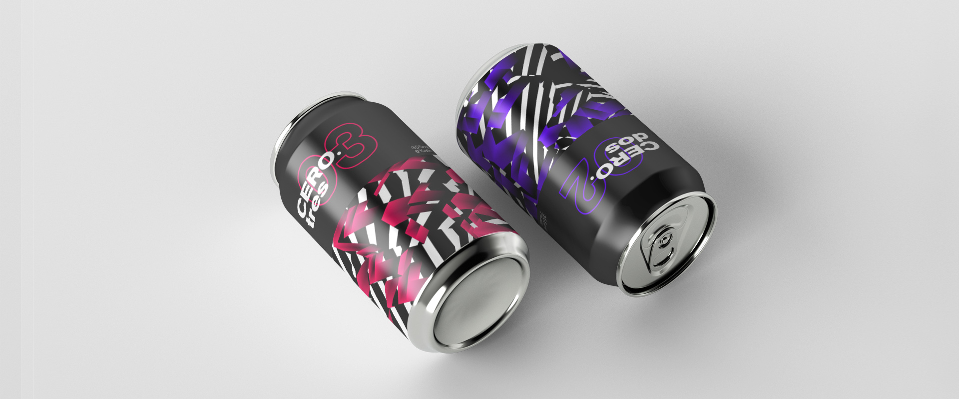
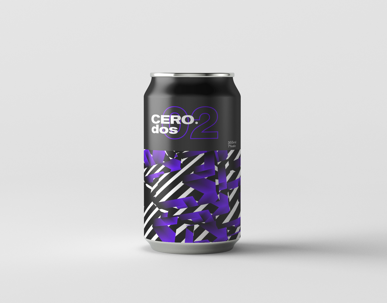
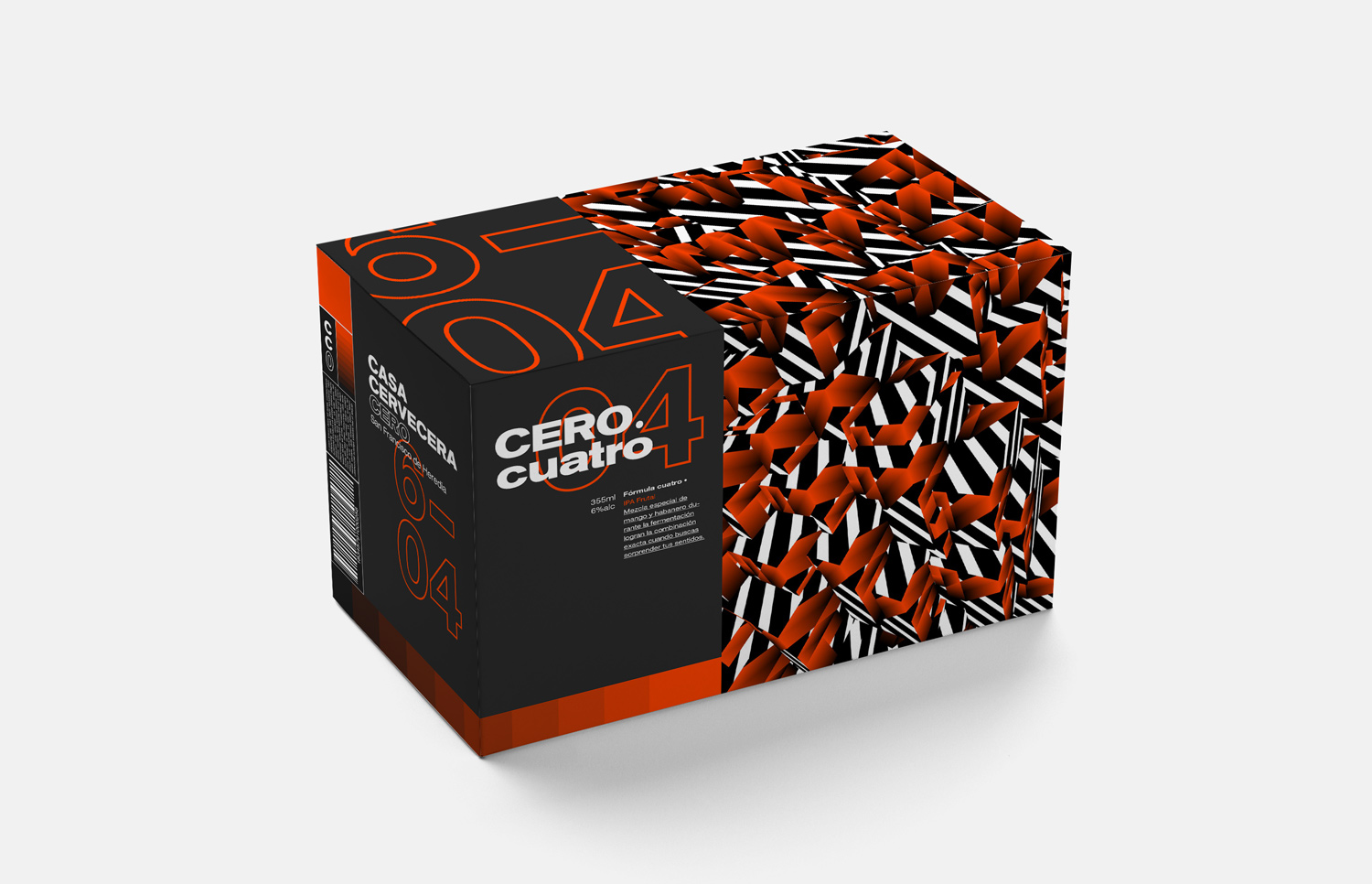
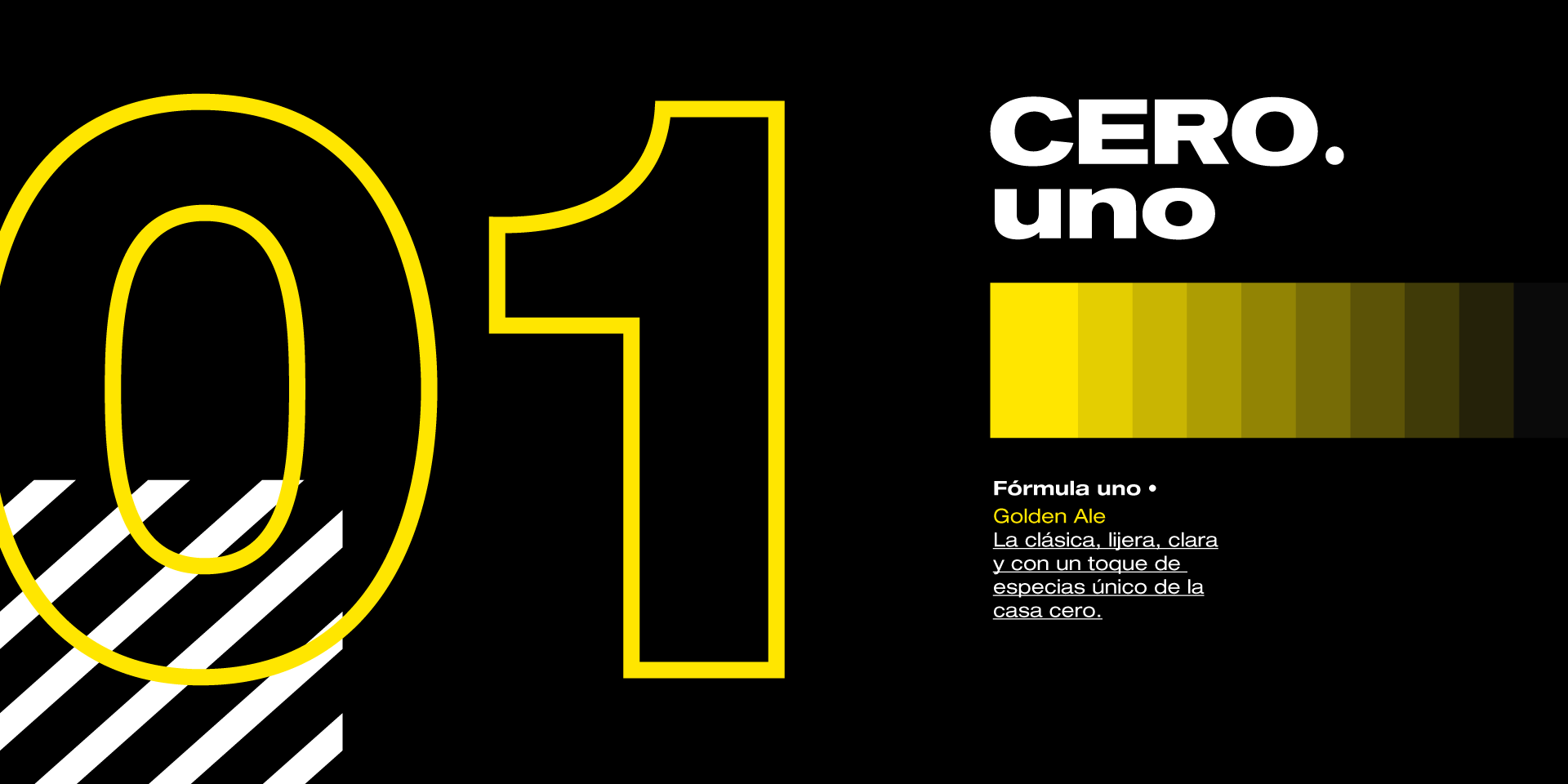
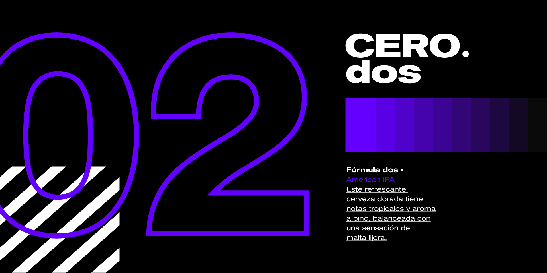
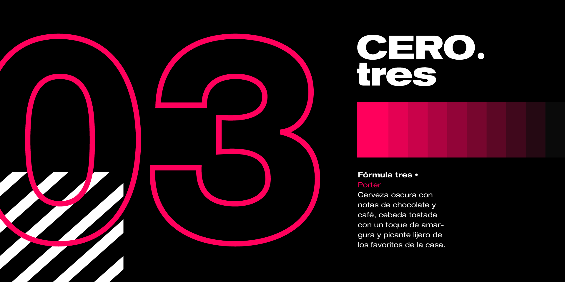
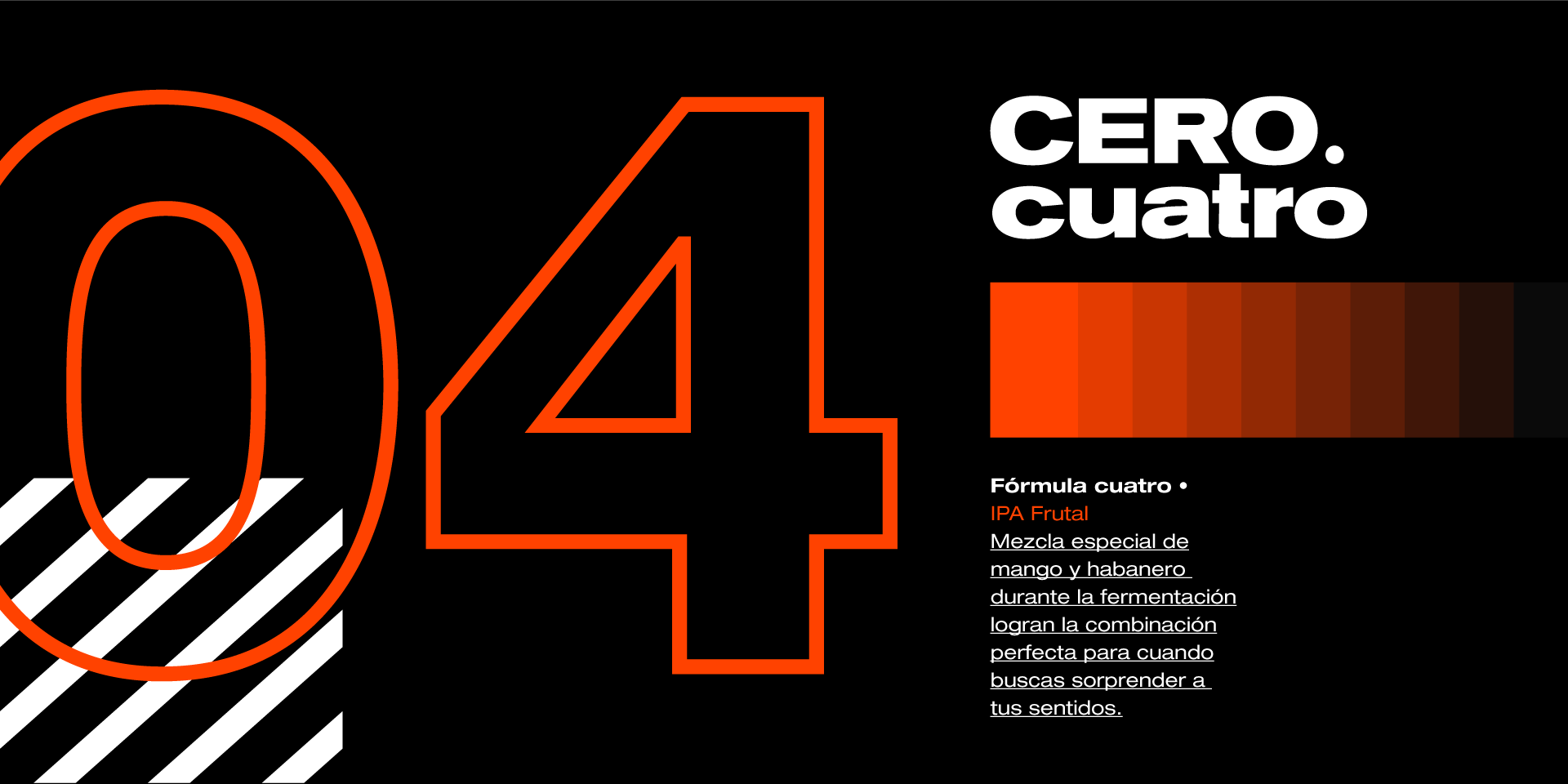
The full identity of each beer was designed to be modular, each one being represented by its own formula number and a characteristic color.
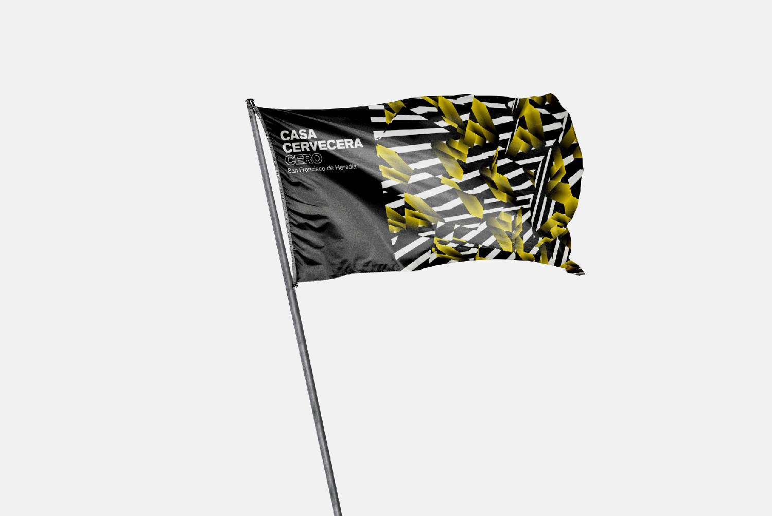
The few and simple elements of the brand, help it gain visual strength and recognition, allowing to share elements within the versions so that they empower the overall brand, at the same time they rely on color to keep each version unique.
02.The Pattern
PROCESSING – HYPE & ILLUSTRATOR
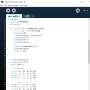
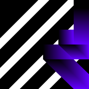
A code based image process was developed to create the pattern that brings the element of differentiation to the visual identity. In hand with the main concept, this was a process led by exhaustive exploration; utilizing the Hype framework for Processing and exploring a variety of examples and implementations, a 3D grid was the form that best served the purpose of both creating unique images and also maintaining visual unity.
A main image module was developed to serve as the base texture for the 3D grid of cubes, and within the code, the ability to interact with the forms via mouse was established to keep a certain level of control on the final image.
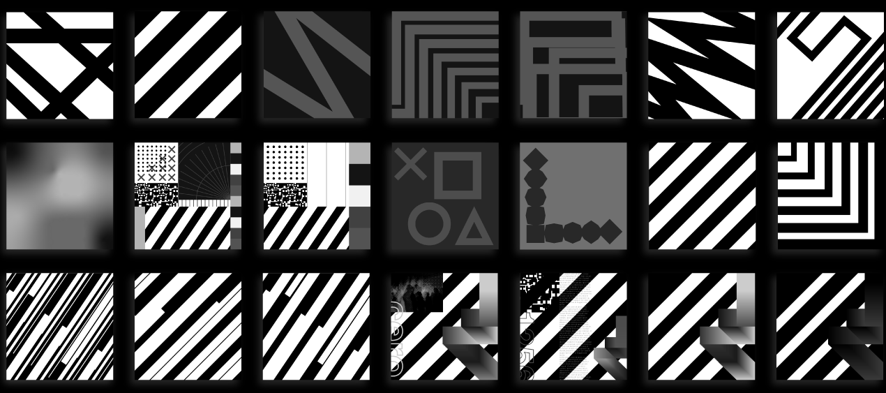
pattern base explorations
03.The Product
BALANCE
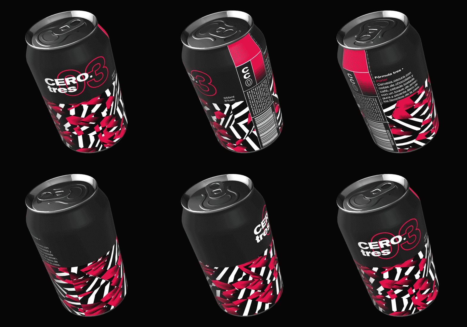
A balanced design was implemented on the cans, to keep a readable and clean look that allows for a strong look and an easy positioning of each of the elements of the visual identity.
The name on the upper part of the can with dominance, makes it easy to read a remember, the bottom delivers the strength and unique design of the brand, and a simple vertical grid on the side has the complete space for all regulatory info without breaking the visual identity.
